From welcome emails to follow-ups
Emails are often the first touch-point start-ups have with their customers. They are key to establishing relationships of trust, and convincing the need for their product or service, and how it can be integrated into their lives.
I’ve decided to become an email connoisseur to make comparisons. I’ve subscribed to emails of over 125 start-ups — so far.
First, let me begin with a preface:
Why does email marketing matter?
1. It’s free and can increase sales once optimized.
72% of donations to Obama’s 2012 Presidential campaign are attributed to emails — that’s $500 million of the $690 million total raised.
2. Some startups began via email. Ryan Hoover blogged about Email First Startups:

Now, Product Hunt should also be added to the list! First Round Capital published an article about how Product Hunt uses email: Product Hunt is Everywhere: This is How It Got There.
3. Email is a more effective user acquisition channel than social media — 40 times more effective than Facebook and Twitter combined, according to McKinsey research.

And now for the analysis —
8 STEPS TO OPTIMIZING EMAIL
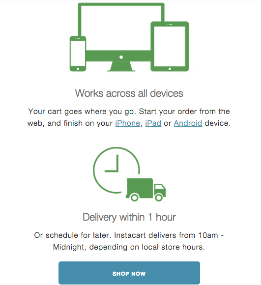
1. OPTIMIZE FOR MOBILE
The facts:
58% of email marketers are not designing for mobile, according to Marketing Sherpa.
48% of emails are opened on mobile devices, according to Litmus.
80% of consumers delete emails not optimized for mobile, according to the Ericsson Mobility Report.
61% of users say they won’t return to a site they had difficulty accessing on a mobile device — and 40% will visit a competitor’s site instead, according to McKinsey.
Takeaway: optimize for mobile to maximize retention.
Use responsive templates so the email automatically fits the device screen.
Make sure any links are also mobile friendly.
Don’t embed large images, because it may cause a long load time. Resize images by 80% with FastStone or JPEGmini, without reducing image quality.
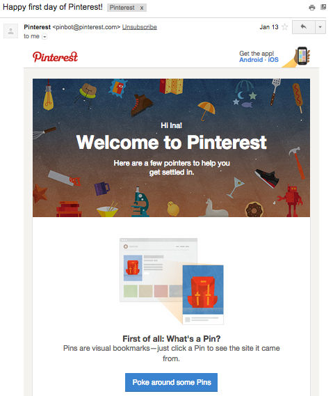
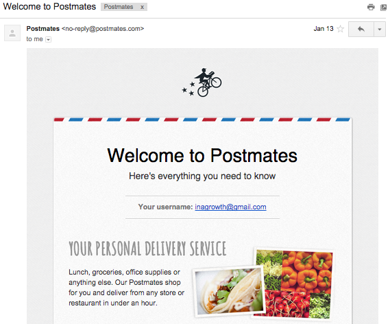
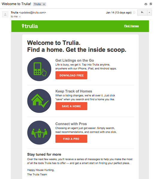
2. PICK A WELCOME EMAIL FORMAT
Many marketers take the advice from the Jackson 5, that it’s as “Easy as 1-2-3”. This welcome email style is best suited when the user needs to be told what to do next.
Below are examples from Facebook, Pinterest, Postmates, RunKeeper, Storefront, and Trulia.


If there’s one action to increase retention, focus your welcome email on just that. Here are some examples of leading indicators for engaged users:
- Dropbox: Putting one file in a Dropbox folder
- Facebook: 7 friends in 10 days
- Twitter: Follow 10 people
- Zynga: Returning the day after signing up for a game
This lesson can be applied to emails to make recommendations to increase re-engagement:
- IFTTT: 3 sample recipes
- Medium: recommends 10 stories
- Quora: 10 items from your feed
- Tumblr: 4 examples of who to follow


3. Test, Test, Test
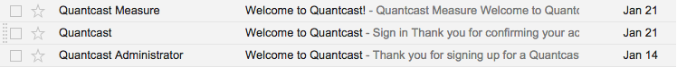
Despite successful companies sharing their positive results from the above welcome email formats, continue to iterate and optimize further. Conduct A/B tests with your emails — but be sure that users don’t receive all the versions you’re testing, as what happened with me for Quantcast!
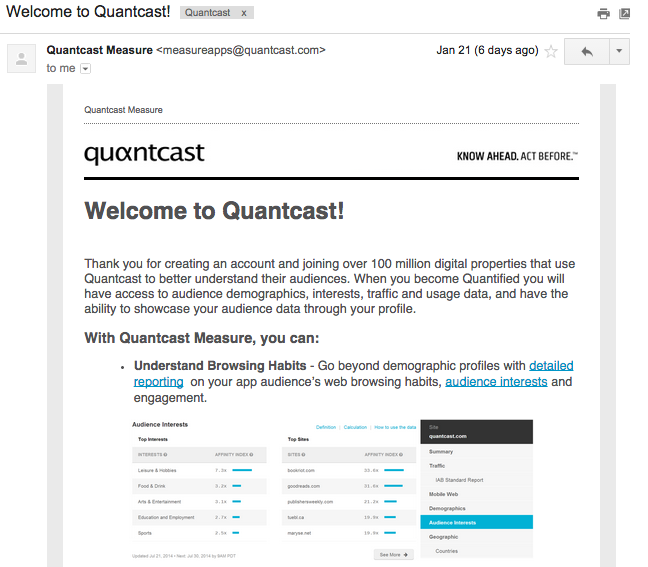
Quantcast welcome email version #1

Quantcast welcome email version #2

Quantcast welcome email version #3

5 Things to Test
Test, Test, Test #1: Sender Name
A. From company:
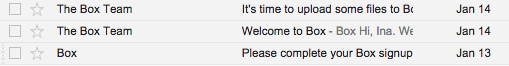
* Box or The Box Team

* Evernote or Evernote Team

* IFTTT or IFTTT Recommendations

* Kickstarter or Kickstarter HQ

* Path or Path Team

* Storefront or Storefront Team
B. From Founder:

* Amy Chang, Accompani CEO

* Tim Westergren, Pandora CEO
C. Combo: from the company or an individual

* Clarity or Dan Martell (CEO)

* Munchery or Jon H. at Munchery or Tri Tran - Munchery CEO

* TaskRabbit or Leah Busque, TaskRabbit
![* Popular in your network or [Twitter handle] (via Twitter) or Twitter](https://images.squarespace-cdn.com/content/v1/54548b00e4b06d59faa6ac23/1422415838114-AYV8ZKHAVYIQVA316PSF/image-asset.png)
* Popular in your network or [Twitter handle] (via Twitter) or Twitter
D. Some companies have “.com” in the sender name. It look cleaner to remove it.
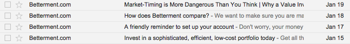
* Betterment

* ModCloth

*WePay

* WordPress
Test, Test, Test #2: Subject Line
- Write creative subject lines. I won’t bore you with listing all of the welcome email subject lines, but most were “Welcome to [Company Name].” Some of the most creative subject lines include:
- Doorman: “You now have a Doorman”
- Etsy: What Will You Discover?
- Misfit: Welcome Troublemaker
- Tilt: High five, Ina! You're awesome :)
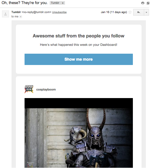
- Tumblr: Oh, these? They're for you.
- Personalize subject lines.
Sandi MacPherson, founder of Quibb, created an algorithm for users to receive a unique email digest Monday through Friday of the top links visited from their network. Quibb users receive an email including these headlines with names of their friends. These emails have a 45% open rate.
- Test symbols, characters, and re-engaging phrases
- Symbols
- DaVita Kidney Care tested the effect of adding symbols to their email subject lines. They discovered a consistent 1.5% left in open rates — when the symbol was at the start of the subject, according to a Marketing Sherpa case study.
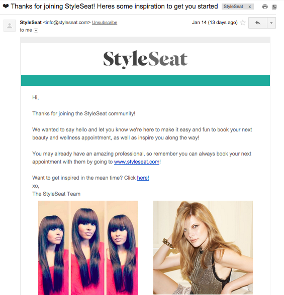
- The only email I’ve received with a symbol is from StyleSeat:

Additionally, Experian discovered that the black heart (♥) results in a 2.2% lift, and the black sun with rays had the highest open rates at 14.9%. But given these statistics it’s still important to remain skeptical, as there are different results for different industries and customers.
- Re-engaging phrases
Experian analyzed reactivation subject lines with the highest transaction rates, and discovered that 13 of the 25 emails with the highest transaction rates had subject lines that included “we miss you”, while only two of the bottom 25 included the phrase. Also, the highest performing offers included free shipping.
Test, Test, Test #3: Content
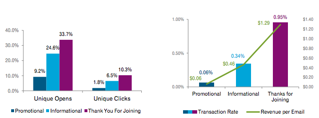
1. Send “Thanks for Joining” emails to increase revenue per email. Source: Experian.
2. Send a survey.
Surveys have twice the number of clicks, and twice the amount of revenue per email compared to standard promotional emails, according to the Experian Marketing Services Email Reactivation Report.
I have not logged into any of the sites I subscribed to emails for with my designated growth marketing account — so I should be on a list of customers to re-engage. Of the 1,000 emails I’ve received this month, only two are surveys.
Path sent a survey three days after signing up:

Fitmob sent a survey hours after I signed up:

Test, Test, Test #4: Calls to Action — 3 Things!
- Placement
- Good examples:
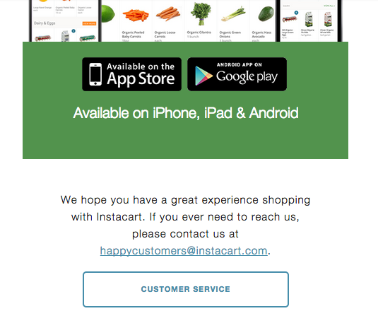
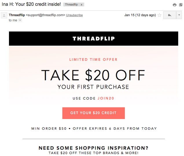
Instacart and Threadflip have calls to actions at the top and bottom:


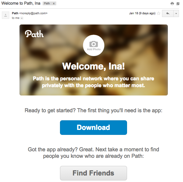
Path has a short welcome email, so the CTAs stand out.
I love how Gilt's welcome message has low opacity, so you can still see a photo representing the brand — while the "Shop Now" CTA remains dominant.


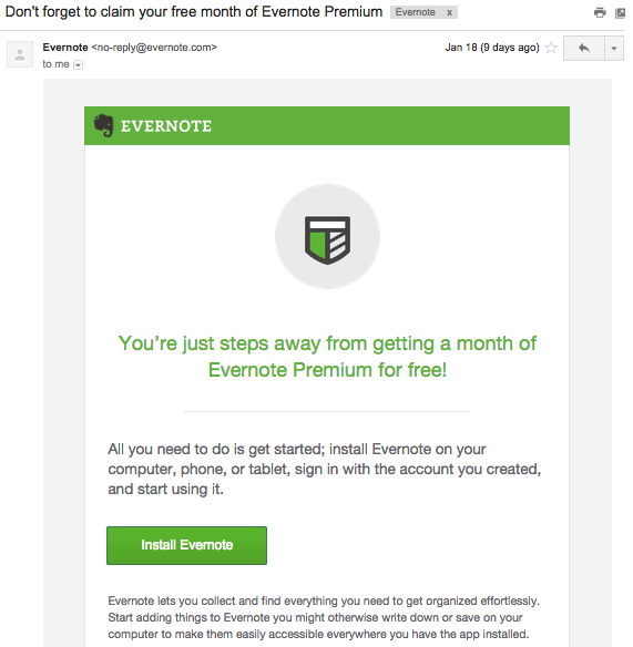
I like how Evernote emails have one short message, with a direct CTA.

Ivan Kirigin, now founder of YesGraph, previously led growth at Dropbox, helping drive 12x growth in two years. He spoke about his experiences driving growth at an Airbnb Nerds Tech Talk. Here’s the video.
He mentioned running an A/B test of adding “PS Get Extra Space Free” at the bottom of transactional Dropbox emails. It took one hour to implement. Results:
- 6% increase in participation of the referral program during testing.
- 50% increase in participation when the P.S. message was sent to everyone.
- These increases lasted forever.
Changing the "download" Dropbox color to red or green didn’t influence the number of downloads.
- Poor Examples of Calls to Action
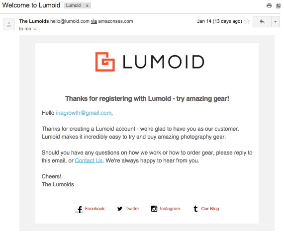
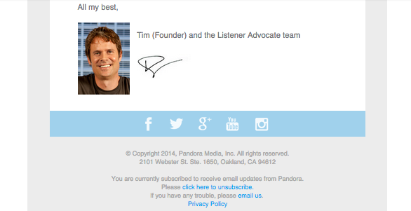
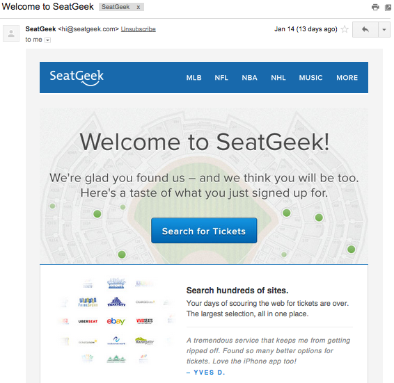
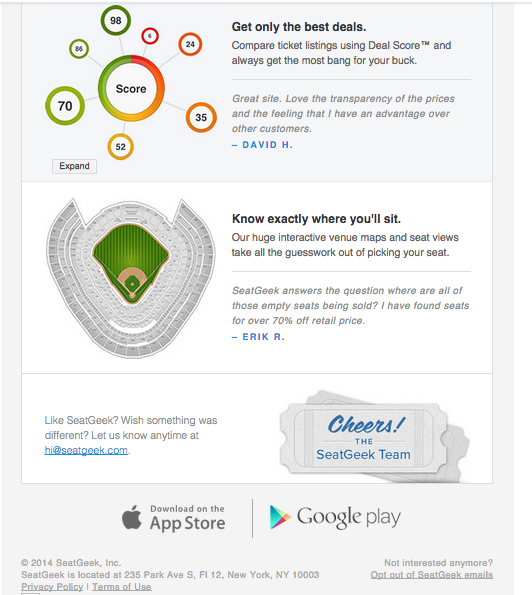
- No CTA
It's great that Lumoid has links to their social media pages, but it would be ideal if they also include a big button to encourage people to browse their gear.
The welcome email from Pandora is a wordy message from the CEO. It would be improved by having shorter paragraphs or better formatting, along with a call to action. — such a reminder to download the app!

SeatGeek should have a call to action at the bottom of the email too, since that's the part people generally see last.
Test, Test, Test #4: Calls to Action — 3 Things!
2. Test different CTAs for the same link.
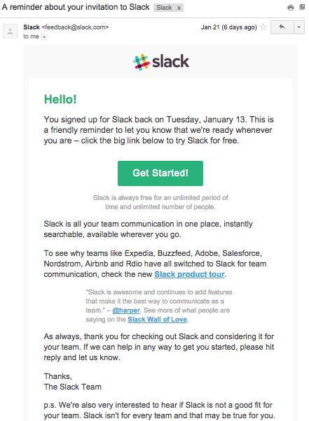
Slack's first email CTA is "Set up your team now" and the follow-up email CTA is "Get Started!" Both buttons direct to the same page.

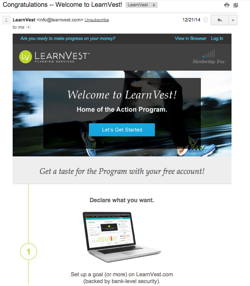
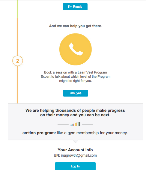
LearnVest has four CTAs, but it's interesting to note that the first and third CTAs ("Let's Get Started" and "Um, yes") direct to the same page, and the second and fourth CTAs ("I'm Ready" and "Login") direct to the same CTA as well.
Marketing Sherpa tested how differed hyperlinked words affects the click through rate. The results (Source):
- "Click to continue": 8.53%
- "Continue to article": 3.3%
- "Read more": (-)1.8%
Test, Test, Test #4: Calls to Action — 3 Things!
3. Style of the CTA — button or link?
AWeber specializes in building software for email newsletter campaigns. They tested to see if buttons have higher click through rates than text (read the details of the test here). For the first three weeks, the button won two-thirds of the split tests, and then text links outperformed buttons by 67% the same as 67% of the time.
Takeaway: The button is effective in the short run, because it’s more obvious. Over time, the novelty wears off, and people become desensitized to it.
I suggest buttons in welcome emails. Here are some examples of emails that can improve with the above insight:
- Strava doesn't have a CTA button. It's just a link.

- StyleSeat should use a button to emphasize the call to action. The "Click here!" in the text body doesn't stand out with the photos.

- Stripe and Import.io welcome emails read like data dumps. Particularly with Stripe, all of the links are distracting. I suggest hyperlinking text to reduce clutter. Also, the help site can be added to the footer to the message.


But still remember the above suggestions about buttons are targeted to welcome emails, which are short-term campaigns. The above research shows that links are more effective for long-term campaigns.
Test, Test, Test #5: Email length
Ryan Hoover tested sending Product Hunt emails with 5 products or 10 products. The later won with a 19.77% increase in the click through rate, and 42.91% increase in total clicks.

4. Include Photos
Some facts:
- 90% of information sent to the brain is visual, according Zabisco.
- 40% of people respond better to visuals.
Takeaway: include photos to engage customers and be remembered.
Twilio has the most creative “hello” image in their welcome email.

On the other hand, the Apartment List welcome email has no images, icons, and a standard style. It doesn’t capture my attention.

Even without images, welcome emails can change style and formatting to increase appeal:
- Bold
- Italics
- Headlines
- Indent
- Short paragraphs
- Color
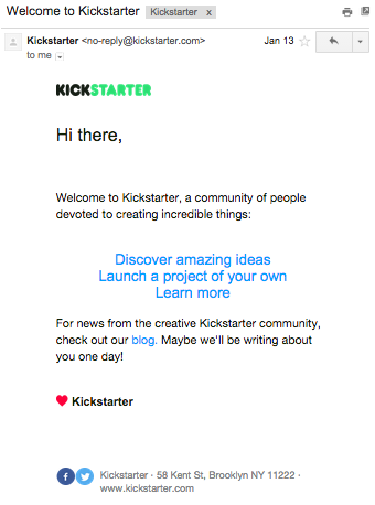
Airbnb, fitmob, and Kickstarter format their emails well to avoid photos.


Besides including photos, consider videos to showcase your product. People are 85% more likely to purchase a product after watching a product video, according to Internet Retailer.
Asana and PayPal welcome emails include product videos:


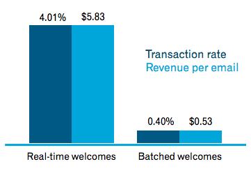
5. Send Welcome Emails in real time
Send welcome emails in real-time via an API call, rather than in bulk. The transaction rates and revenue per email will be 10x higher, according to Experian Welcome Emails Guide.
6. Segment Emails
Gilt Groupe segments customers based on click-throughs, browsing history, and purchase history. Each group receives a targeted email, resulting with 3,000 versions of the daily email, according to McKinsey.
A financial institution implemented life-cycle events to trigger personalized emails to current customers. This increased revenue from the targeted segments by 20%.
Williams-Sonoma improved response rates tenfold by segmenting customer emails based on browsing and purchase history.
Obama’s 2012 Presidential campaign segmented emails, which led to $500 million in donations from email marketing.
Here’s how they divided emails to send targeted messages:
- Previous donors
- Quick donors — a subgroup of previous donors who saved their payment details to their profile. These people received emails with “quick donare” links, which led to conversion rates increasing 300%.
- Non-donors — many of these people had been on the email list for an extended time, but had never donated.
- Lapsed donors — 2008 campaign donors who had not yet donated to the 2012 campaign.
Here’s the best performing email of Obama’s 2012 campaign, which raised over $2.6 million:

You can read the full case study by Marketing Sherpa here.
7. Develop a follow up Email strategy
At the GrowthChats Meetup, Zack Onisko mentioned Creative Market does not send e-mails about product changes. They don’t want to spam their customers with emails. People are also often resilient to change, and only appreciate the change after seeing the new experience.
You can schedule emails based on events (the number of days since the customer signs up or following up with customer behaviors: purchase & browsing history) or the day of the week.
Creative Market emails are scheduled by the day of week:
- Monday: Free This Week:___
- Tuesday: Last Chance! ~
- Wednesday: New This Week: ___
- Thursday: Thanks for an incredible 2nd year!
- Friday: Trending This Week →
Here are other examples of follow-up emails:
Pinterest:
- Day 1 (Tuesday) : Happy first day of Pinterest!
- Day 2 (Wednesday): Some of what you'll find on Pinterest
- Day 6 (Sunday): Another thing you can do on Pinterest: Plan your next trip!
- Day 7 (Monday): Another thing you can do on Pinterest: Renovate your home!
- Day 9 (Wednesday): You've got 25+ new Pins waiting for you
- Day 11 (Friday): Fresh Pins for you!
Move Loot:
- Day 1 (Tuesday): Welcome to Move Loot
- Day 2 (Wednesday): This Week's Curator's Picks
- Day 4 (Friday): Enjoy Your Long Weekend With 20% Off
- Day 5 (Saturday): Our Weekend Sale Isn't Over Yet
- Day 6 (Sunday): Two More Days of 20% Off
- Day 7 (Monday): Today Is The Last Day for 20% Off
- Day 8 (Tuesday): Refer Your Friends
- Day 9 (Wednesday): This Week's Favorites, Hand-Picked by our Curation Manager
- Day 11 (Friday): Beaut-ility
- Day 13 (Sunday): Best of Sale
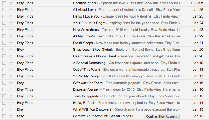
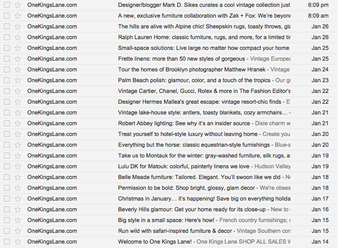
Etsy, LearnVest, Move Loot and One Kings Lane win the prize for sending the most emails — almost daily.


Once confirming my email address and receiving a welcome email, I was surprised that I didn’t receive any follow-up emails from some startups:
- Misfit
- Modcloth
- Pandora
- Postmates
- RunKeeper — I received push notifications instead
- Square
- Stripe
- StyleSeat
- Twilio
- WePay
- ZocDoc
8. Automate emails as much as possible.
A Forbes article discusses the growth “hacks” that Andy Johns, Director of Growth & Revenue at Wealthfront, has been part of.
When he began at Twitter in August 2010, emails were sent to users by running Python scripts by hand. The process took three days to send 10 million emails — so emails were only sent once a month. The result was the creation of a growth team, and the implementation of automated notifications and new features like “favorites” to help improve user retention.
Recap: Optimizing emails
- Optimize for mobile.
- Pick a welcome email format: 1-2-3 style or recommendations
- Test, Test, Test: sender's name, subject line, content, calls to action, email length
- Include photos or a product video.
- Send emails in real time.
- Segment emails.
- Develop a follow-up email strategy.
- Automate emails as much as possible.
Bonus: Compare your metrics against industry benchmarks to help identify potential areas of improvement.